Datavisualization
Dataviz | UX/UI | Power BI
Client brief, workshop, wireframing, graphic guidelines, user interface, agile
Illustrator, Sketch, Zeplin
Context:
Within Expertime, I have been able to carry out Datavisualisation projects with clients like Pernord Ricard, SNCF, Danone ... The objective of these projects was to create simple and quick to understand dashboards for users so that they can understand at first glance, what the data collected correspond to.
Solution:
For this type of project, the process was always the same: workshop at the customer's site to collect the need, understand the data, know how it was collected and what it represents. Once this task has been completed, propose a wireframe 'template' which will be used on all dashboards so that they follow the same logic. Once this template validated, I add the graphic part. There were often around fifteen dashboards to complete as a week-long sprint.
Data | Agile | 40 screens
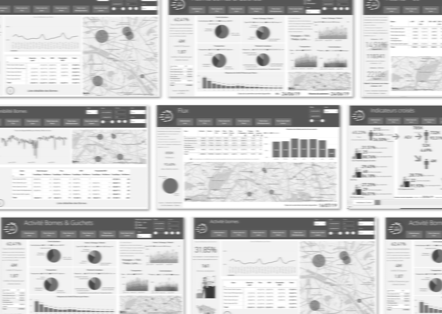
Before my intervention - This image has been blurred for privacy
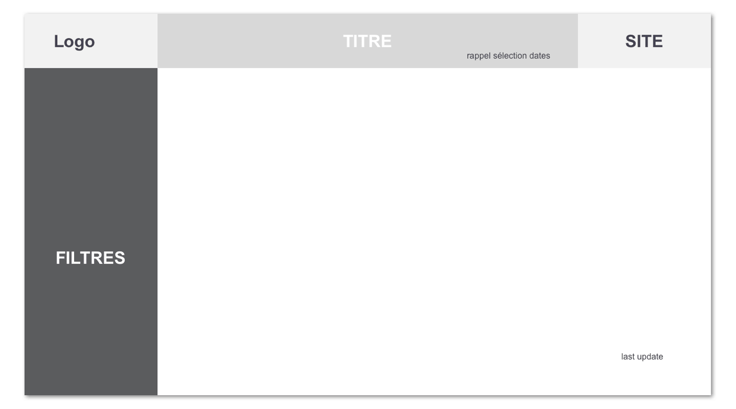
A template example
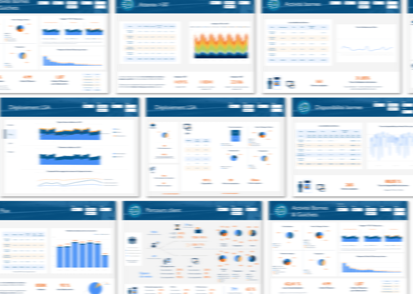
After my intervention - This image has been blurred for privacy